
Silver Birch was a spirit guide who spoke through Maurice Barbanell
you can allow it to work through you
Silver Birch was a spirit guide who spoke through Maurice Barbanell
you can allow it to work through you
Let’s talk about CONTRAST, in particular when it comes to adding text to a digital photograph or image.
A blogger friend of mine (and no doubt soulie sister too) tried something new, for which I applaud her! She was drawn to take some photos and add a note to each of what they meant to her, how her soul resonated with what she was photographing. And that’s huge! To be the observer, and to do something different with your art! What expression! What JOY!
And her actions sparked an observation within ME! I realized I had not written specifically about the contrast of text on photos, and how this correlates to the CONTRAST of, or within Life!
So, here we go. I’ll show what I mean by the best way to contrast text on your photos (and yes, I have a degree in Visual Communications and specialize in 508 compliance during my day job).
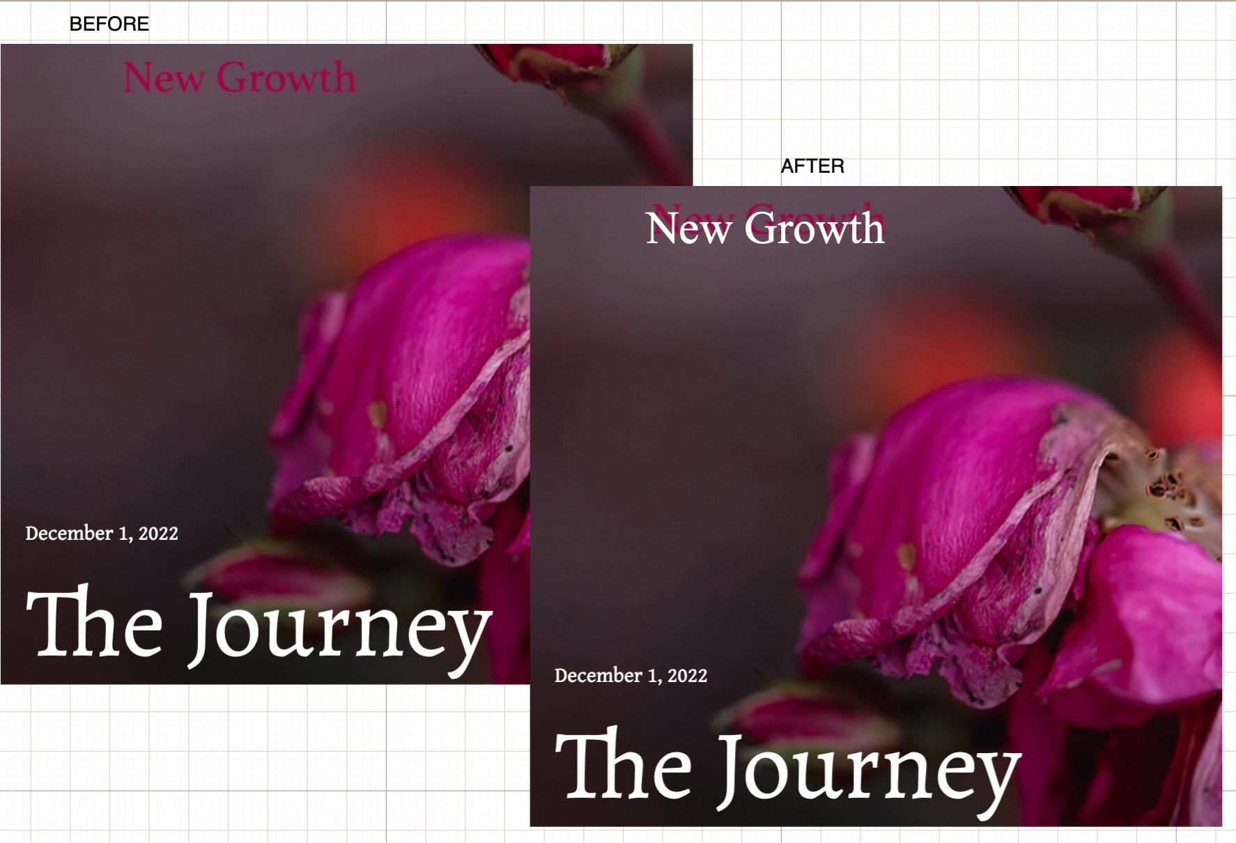
Here’s one of her photos that I couldn’t see the text of very well, in fact, I missed it the first time I read her post: https://herladypinkrose.wordpress.com/2022/12/01/the-journey-2/
And here’s how I color corrected the text so I could see it. You could also just add a white glow or outline to the text as well (but I took the easy way out):
Now, just so you know I’m not picking on AmyRose, I noticed this white text on a website I viewed and how it sort of “gets lost” within the lighter areas of the Yew tree branches, making it difficult to read:

And this is how I fixed it: On AmyRose’s blog image, I attempted to match the font and size in a lighter color and place it over her text. If I had Photoshop on my laptop, I’d have cloned out her text and then added mine, but alas when you pay Adobe for the Creative Suite (as we do for our iMac) they don’t allow you to use it on another device. (Not so good of you, Adobe Products.)
Anyway, similarly, on the Yew page, I matched their Times font and white color, but because of the kerning involved I couldn’t match it exactly. I wanted to simply type their “The yew tree baffles…” paragraph in a black font and lay it under the white so I could overlay their verbiage and be able to see a couple of the words better. In particular, the “is” which happens to lay on a lighter part of the yew tree image making it very difficult to see. I ended up adding a black font “is” over the white font paragraph I’d placed there, to call a bit more attention to it, though in a perfect world, and again, if I had Photoshop on my laptop, I could do an A+ pro job on this. We have to work with the tools we’re given though! LOL
Remember this rule, light on dark or dark on light works best for text on pictures. And stay away from the red or pink tone colors as these are difficult to read for anyone who may be visually challenged (color blind).
As for my day job, I don’t have any graphic tools on the PC laptop. So, I do all my changes in Paint. I yearn for a day when I don’t have to work so hard in order to make changes to application screens. I also used to use Snag-It which was very helpful, but currently only have access to the Microsoft Snipping Tool that comes standard.
One former place of employment used a fuchsia color for all of their image callouts. I challenged that decision based on contrast ratios but I didn’t win the argument. Sometimes, you have to follow what the company’s design guide dictates. If you have a choice however, always opt for the highest contrast you can work into your design.
If all else fails, you can reach out to me. I’m available a few hours a week for freelance side gigs and do proofreading, editing, color corrections, etc.
Tip: Here’s a helpful color contrast ratio chart: https://contrast-grid.eightshapes.com/
A bit about us:
My husband is an award-winning illustrator, plus he is a seasoned guitarist, bass player, and songwriter (of over 400 original songs). You can view some of his artwork and listen to all of his songs at: http://listen4music.com
Fractal of Omniscience. “Spiral Sister”🌀Observer & Perceiver of Energy & Wisdom from Nature. Empath|Author|Connector|Speaker|Singer.❤️🦋🌀🎼〰️🙏🔥☯️
I would love to speak at your bookstore, crystal shop, acupuncture / chiropractor office, or other holistic / natural fair or festival. I support healthy lifestyle businesses. For information on ALL of my books, visit my Amazon Author page.
An Amazon bestselling author of two co-authored books: Transform Your Life Book 2 Inspirational Stories and Expert Advice, Energy of Receiving, and author of the captivating Blue Eyes: Ethereal Messages of Connection as well as the incredibly helpful 2nd edition of Have Yourself a Wholly Vibrant Life: Reversing Asthma and Other Chronic Illness Naturally.
Be the best version of who you want to be–who your soul beckons you to be. It’s important because who you are in this world affects us ALL. We Are All Connected.
Information provided is for educational purposes only and is not intended to treat, diagnose or prescribe.
For more about this blog, how I create digital designs, why I wrote a holistic health book, and more, find me on Facebook, Twitter, and LinkedIn.
Follow me on Instagram: https://www.instagram.com/takeonyourself/

There is a line in George Michael’s song, Freedom, that asks of us: “all we have to do now, is to take these lies and make them true somehow.” And the answer I received about its meaning was:
When you can (though you may never be adept enough in every circumstance) take a lie, or what you perceive as a lie, and can find a truth (as opposed to THE truth) in it, then that is real Freedom. Freedom in one’s mind.
A bit about us:
My husband is an award-winning illustrator, plus he is a seasoned guitarist, bass player, and songwriter (of over 400 original songs). You can view some of his artwork and listen to all of his songs at: http://listen4music.com
Fractal of Omniscience. “Spiral Sister”🌀Observer & Perceiver of Energy & Wisdom from Nature. Empath|Author|Connector|Speaker|Singer.❤️🦋🌀🎼〰️🙏🔥☯️
I would love to speak at your bookstore, crystal shop, acupuncture / chiropractor office, or other holistic / natural fair or festival. I support healthy lifestyle businesses. For information on ALL of my books, visit my Amazon Author page.
An Amazon bestselling author of two co-authored books: Transform Your Life Book 2 Inspirational Stories and Expert Advice, Energy of Receiving, and author of the captivating Blue Eyes: Ethereal Messages of Connection as well as the incredibly helpful 2nd edition of Have Yourself a Wholly Vibrant Life: Reversing Asthma and Other Chronic Illness Naturally.
Be the best version of who you want to be–who your soul beckons you to be. It’s important because who you are in this world affects us ALL. We Are All Connected.
Information provided is for educational purposes only and is not intended to treat, diagnose or prescribe.
For more about this blog, how I create digital designs, why I wrote a holistic health book, and more, find me on Facebook, Twitter, and LinkedIn.
Follow me on Instagram: https://www.instagram.com/takeonyourself/
The reason I write and speak so much about Omniscience is because that word, instead of God, transcends ALL. Omniscience transcends boundaries. Omniscience overlays all other belief systems. Omniscience allows.
There is a Grace to Omniscience, Omnipresence.
If one is a Christian, you know Omniscience.
If one is Jewish, you know Omniscience.
If one is Muslim, you know Omniscience.
If one is Pagan, you know Omniscience.
No matter what other label you are, you know Omniscience. You know the Energy that transcends ALL.
There is no need for church, temple, synagogue, mosque, or other external structure. You don’t need to go anywhere to BE with Omniscience.
Omniscience is with you wherever you are.
Omniscience meets you in whatever condition you are in. Sad, lonely, depressed, in despair, or on the verge of cRaZy.
Omniscience cares for you, loves you, adores you, and finds you worthy.
One can label God and think of God as a personage, but as soon as you make this distinction, the opportunity is open for opposition and disagreement. If you want to find a way to agree and connect in Unity, it’s easier to go general and adopt the highest view of Source.
You are a fractal of Omniscience. And Omniscience envelopes you. Omniscience is in, through, and all around you. And you are important. You are not merely dust in the wind.
Spirituality, or BEing spiritual, is knowing Omniscience IS.
Kiss your hand. Feel the Energy of your body. Feel the essence of life.
Prayer seeks Omniscience to listen. Mindfulness, meditation, and flowing in a soul-connected way to create something are ways you can listen to Omniscience. Be available for that communication.
We Are All Connected.
Your soul-aligned friend in Connection.
Many blessings to you in ALL ways.
Check out how we perform our original song, Feel The Love: https://vimeo.com/416919212
And you can find our newest album: https://music.apple.com/us/album/songs-from-the-r-v/1487331598
I would love to speak at your bookstore, crystal shop, acupuncture / chiropractor office, or other holistic / natural fair or festival. I support healthy lifestyle businesses. For information on ALL of my books, visit my Amazon Author page.
An Amazon bestselling author of two co-authored books: Transform Your Life Book 2 Inspirational Stories and Expert Advice, Energy of Receiving, and author of the captivating Blue Eyes: Ethereal Messages of Connection as well as the incredibly helpful 2nd edition of Have Yourself a Wholly Vibrant Life: Reversing Asthma and Other Chronic Illness Naturally.
Be the best version of who you want to be.
Information provided is for educational purposes only and is not intended to treat, diagnose or prescribe.
For more about this blog, how I create digital designs, why I wrote a holistic health book, and more, find me on Facebook, Twitter, and LinkedIn.

In a recent dream of my mother, she encouraged me to enjoy talking with my friends about sacred journeys and to see the book of Kells, which joyfully, I’ll be visiting in September 2019–that changed to June/July 2019–see the link here:

I’ve heard a few people say that we’re not all connected. That’s because sometimes it IS hard to understand how bad things happen in the world, if we really are “All Connected”.
They may not want to hear, believe, or know–but We Are All Connected.
We cannot disconnect from our shadow.

So, though it might be difficult to hear or accept sometimes, everything happens for a reason. And there IS value in EVERYTHING. Even if it is seeing what’s wrong, and then choosing to do better–or make a different choice.
You don’t need a clear blue sky everyday of your life to be happy. Embrace the clouds and shadows of yourself, and of those around you–to be happy no matter what!
Accept.
Allow.
Embrace.
Love – without conditions. Nobody’s perfect.
Judge not.
When you have judged, forgive.
Be grateful for all of the lessons.
Move on (if need be).
Learn, choose, and focus again on what “feels good”. Compassion, kindness, heart-centeredness. Be nice.
You CAN choose. You have that power.
Do you know what’s missing in Artificial Intelligence (AI)?
Imperfection!
We humans are drawn to the imperfect!
It’s why we’re drawn to art and Live performances.
Flaws in movies stand out; we become critics.
And we attract drama (or bullies) into our lives.
It’s a human condition!
No one is perfect. Which means we are all worthy of love!
Draw in and cherish the flawed ones in your life AND the flaws in YOU!
God’s creations are pure and beautiful! WE are the only ones who perveive flaws!
Blessings to you all in ALL ways.
Peace.
Love.
Namaste. OM
An Amazon bestselling author of two co-authored books: “Transform Your Life Book 2 Inspirational Stories and Expert Advice,” “Energy of Receiving”, plus author of “Blue Eyes: Ethereal Messages of Connection,” and holistic health book that details how I naturally reversed asthma, “Have Yourself a Wholly Vibrant Life: Reversing Asthma and Other Chronic Illness Naturally” all available on Amazon.
Be the best version of who you want to be.
Information provided is for educational purposes only and is not intended to treat, diagnose or prescribe.
For more about me, this blog, how I create websites, why I wrote a holistic health book, and more, find me on Facebook, Twitter, and LinkedIn.
